Design Primer & Resources
Understanding Design Terms & Concepts
This page is designed as a primer to begin the process of working me as your designer. These concepts and terms will help you clearly explain what you expect from me as your designer. This will help move the process more smoothly making the task of identifying your business needs less difficult. You may also notice the terminology in this primer may vary from terminology you are familiar with. Designers from other disciplines may use different terms that are sightly different for the same term or concept, this is okay. I have experience with enough disciplines to pick up on these subtle differences, so don’t worry.
The biggest goal in providing this primer is to speed up the process and save you money. When using this guide you will find that some design styles may be a better fit for your budget. For example, a logo design that uses a “symbol” style may cost more to promote than a “combination mark” design. If your needs require a logo mark to be used for different situation that is understandable and a complete branding guideline can be created.
Keeping It Simple!
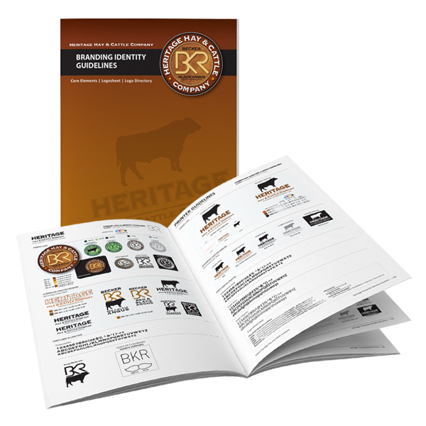
LOGO AND SYMBOL DESIGN

LOGO MARK
Letters of the name are using to create the logo. In this example the image was an actual livestock brand concept. You can see how the individual letters create the image for the name Becker.

SYMBOLS
Marks without type used to identitf a business, agency or institution. The advantage to a symbol is the simplicity and they are easily recognizable. The disadvantage to a symbol comes in the cost to promote and explain. They can also be legally protected.
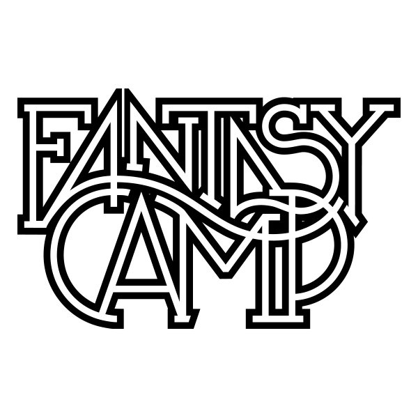
LETTERMARKS
Most lettermarks use acronum, an abbreviation using the first letters of each word in the title. Some acronyms can be pronounced as a word while others the individual letters are spoken.
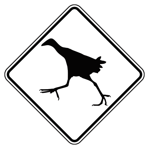
PICTOGRAPH
The pictograph is often used in signage to communicate information to help remove the language barrier. These symbols can be seen as directional indicators on highways or congested urban areas.

COMBINATION MARK
This is a logo that is designed using both symbols and logomarks. The symbol is solid or outlined in appearance, and the symbol may appear abstract in style supporting the logotype.
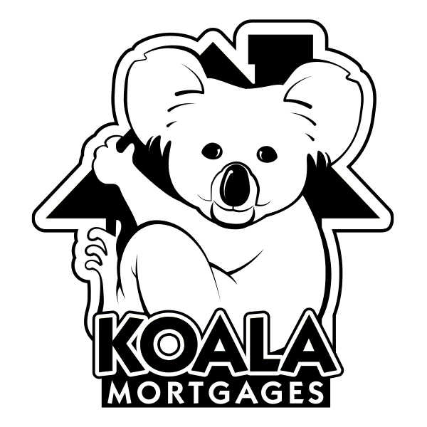
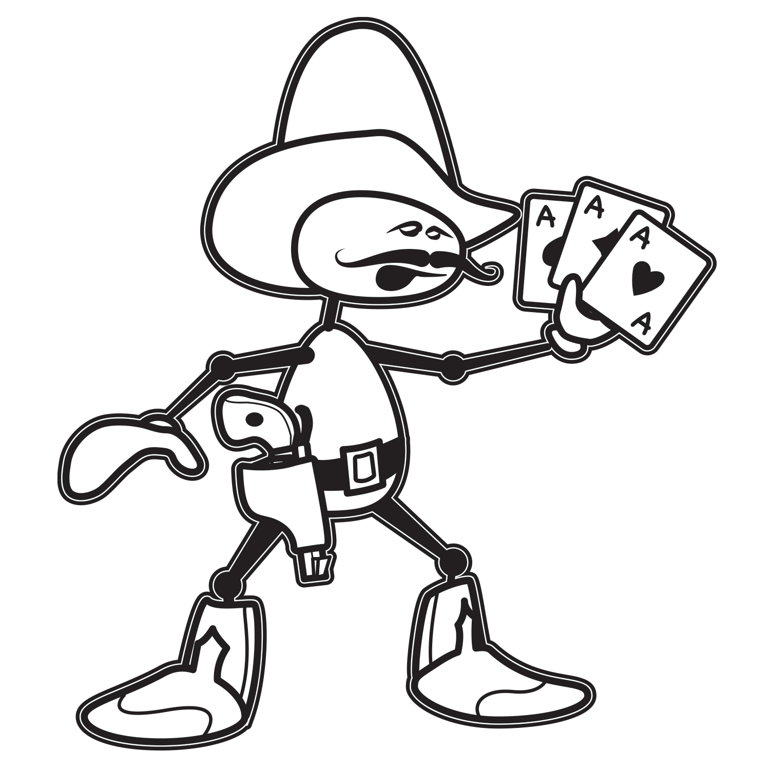
MASCOT LOGOMARK COMBO
The mascot logomark is used to communicate a playful vib for the company brand. This type of logo is used by businesses and organizations that want to attract client that a looking for fun or playful products or services.
LINE
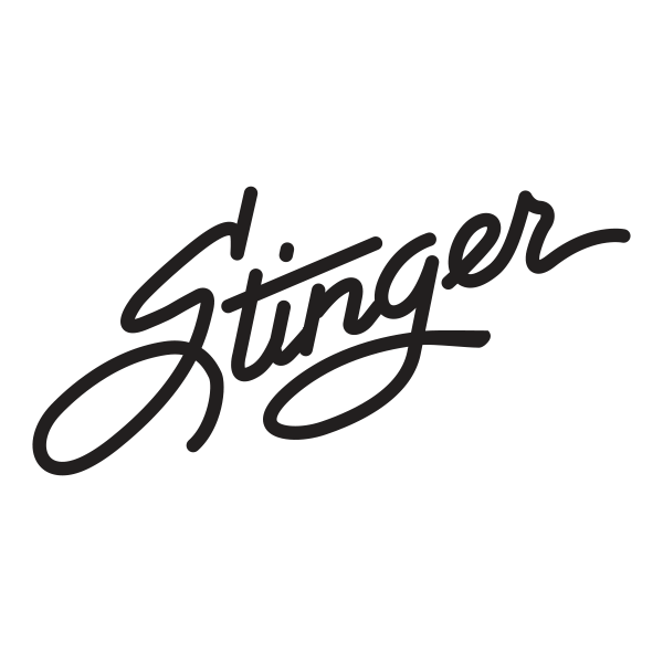
Lines create a path, motion and mood. Elements are used as a design style to guide or lead a readers eye to different information. For example lines are used in an organization flow chart to create flow. Lines will can direct a viewers eye or even stop the flow within certain circumstances. When a line is used to create an element it can communicate a whimsical or hard emotion, that can be seen in a persons signature or a divider line on a page. The use of lines can also conveys motion and add structure needed in a layouts hierarcy.
SHAPE
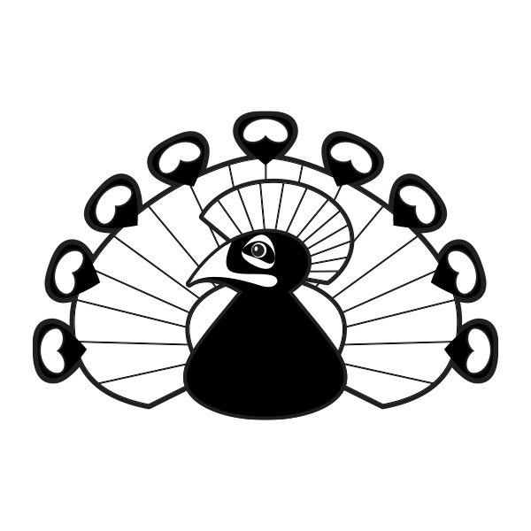
Shapes used in design elements and in the overall layout in your design can the overall feel of your design. Shapes can be vasically described as geometric or organic (abstract) or the use of shapes can soften or harden the overall message. And some well design elements can be combination of both creating uncertainty during dialog that is inquisitive.
Shapes can also be instrumental in simplifying design hierarchy. Designers will utilize white or negative space to communicate concepts or spotlight a product in a design. That negative shape can be very powerful for the business message.
HIERARCY
Hierarcy is creates flow in your design and tells the viewer what is the most imprtant information. For example on a business card the holders name maybe the most important information. While on a brochure or website the paragraph header maybe the point of emphasis. The best way to structure hierarchy is through structure and style. Titles or text of greater importance are placed first and will have bold typefaces and important information maybe placed as a pull quote or separated into an information box. But as a general rule information flows from right to left and top to bottom. Most important items are generally located to the right or top.
COLOR HARMONY
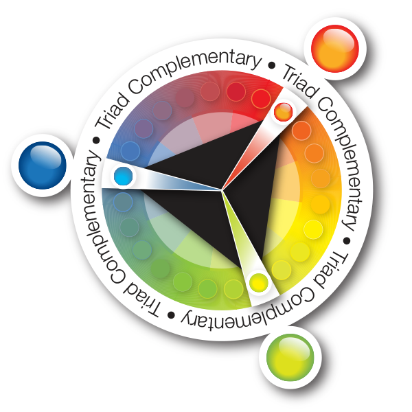
Color harmony is complex and simple at the same time. What I mean by that is this, there are certain combinations of color that are easy to work with while others need to be twicked. The more complex the more time it takes to fine the perfect balance. There are very few designers that can work without the use of a color chart or a style guide when working with a company brand. Color palettes are created to avoid creative license when a product using a brand is being created. You must also understand that color is a science, and getting consistant results require a great deal of effort.

FORM
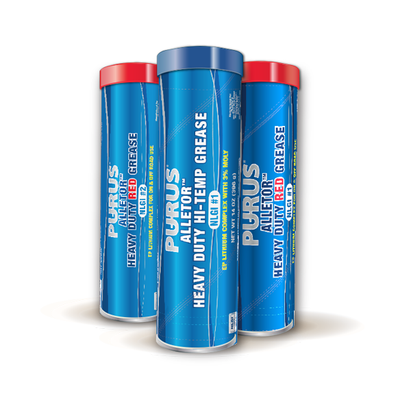
Form gives a design dimension. Using different design techniques like drop shades and highline marks you can take a 2 dimensional design make it standout giving it the illusion of jumping off the page. These effects can also be put to use to create distance between different objects on a plane or substrate. Take the design above for example, there are several layers with varied degrees of drop shadow, a radial gradient using shade and values to create depth and a reflection mark on top to show shape and light. The use of these techniques create form and dimension.
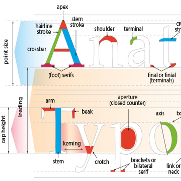
TYPOGRAPHY
The voice of design, nothing in design has the double punch than a typeface. The proper use of a typeface can make or break the design. The use of a typeface can make or break a design or logo and as a general rule the simliar the better. There is sometime about the power of a typeface that can make or break a logo. And you don’t need to be a design rockstar to see the problem with a bad typestyle choice. The choice of typestyles is sometimes a choice built on a lack of choices and requires a new option that is designed from scratch. Or it may only take the use of a common typeface with minor alterations. Trust me a typeface can be a trick element for many reasons, even the test of time and taste.
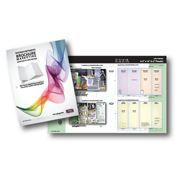
PUBLICATION TYPES
This section is a guide to the type of publications and documents that can be created both electronically and traditionally to further your marketing efforts. This guide is based on a “integrated marketing” approach that uses both traditional and electronic marketing concepts. This process can be used to create a sustainable marketing effort that captures leads in a CRM database system or designing publications used as leave behind materials. These publications can be used to build your on-line presence as well as provide a resource to understanding the publications and process that work best together.
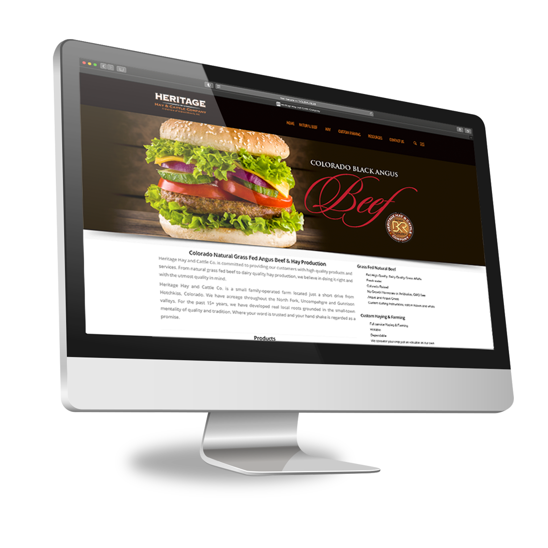
WEBSITE RESOURCES
Web services come in a variety of plans and packages. It is important to have a plan that uses your website as a marketing tool, not just an electronic brochure. The best way to acheive this goal is to work with a designer that understands the process and understands the purpose of your website as a lead generator or contact point for your team. A website is a critical forum in today’s world to find business outside of your local area of influence, especially in a world where direct contact has been reduced. A good integrated process provides information needed to capture and retain leads through the process of being an authority in your specific field or being an invaluable resource for information. But no matter what your objective is for your website you most be consistent by providing new and fresh content everytime it is visited and that takes effort.
PRODUCT MOCKUPS
The mascot logomark is used to communicate a playful vib for the company brand. This type of logo is used by businesses and organizations that want to attract client that a looking for fun or playful products or services.
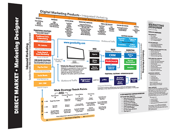
MARKETING PROCESS
Marketing can be a challenge, but it doesn’t have to be. It has been interesting over the years to watch marketing processes come and go, but a few simple “basic” principles will always remain the same. Expose, direct, capture, sale and repeat. It doesn’t matter if you use social media or shoe leather to create the network the process can be broken down into these basic steps. A sustainable marketing process requires a sustainable, believable and repeatable approach. And sometimes the best approach isn’t that easy to determine. While social networking maybe great when used for certain demographics you may find that direct mailing maybe better for a larger local markets. Sometimes the best plan can only be determined by budget and degree. If the message is only reaching a small demographic then maybe it isn’t the message or product, maybe it who and where it is being “exposed”. Sometimes we fight the process because we are “married” to the marketing concept. If social media isn’t bring in the traffic, maybe it is time to take an in their face approach to change things up.
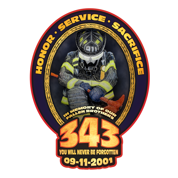
COMBINING TRADITIONAL WITH ELECTRONIC CONTENT
Combining hand drawn or painted materials with electronic can add flare to a design.
COPYWRITING & TYPESETTING
Copywriting is one of the biggest needs in the design and marketing world, and one of the most neglected areas in the process. Each day you can see examples of websites and blogs that are riddled with grammatical and spelling errors. And some bodies of text leave out words or letters altogether. We can help your creditability by creating content that communicates in a quick and effective way, reducing confusion and dropped readers.
Do you have time to enter copy into a word document for a manuscript or website? Keyboarding for long hours can be very draining, so draining it is can be more cost effective to hire a professional. And periods of typesetting can take a toll day-in and day-out. If you find yourself in that situation let us know maybe we can help.

TEXTURE
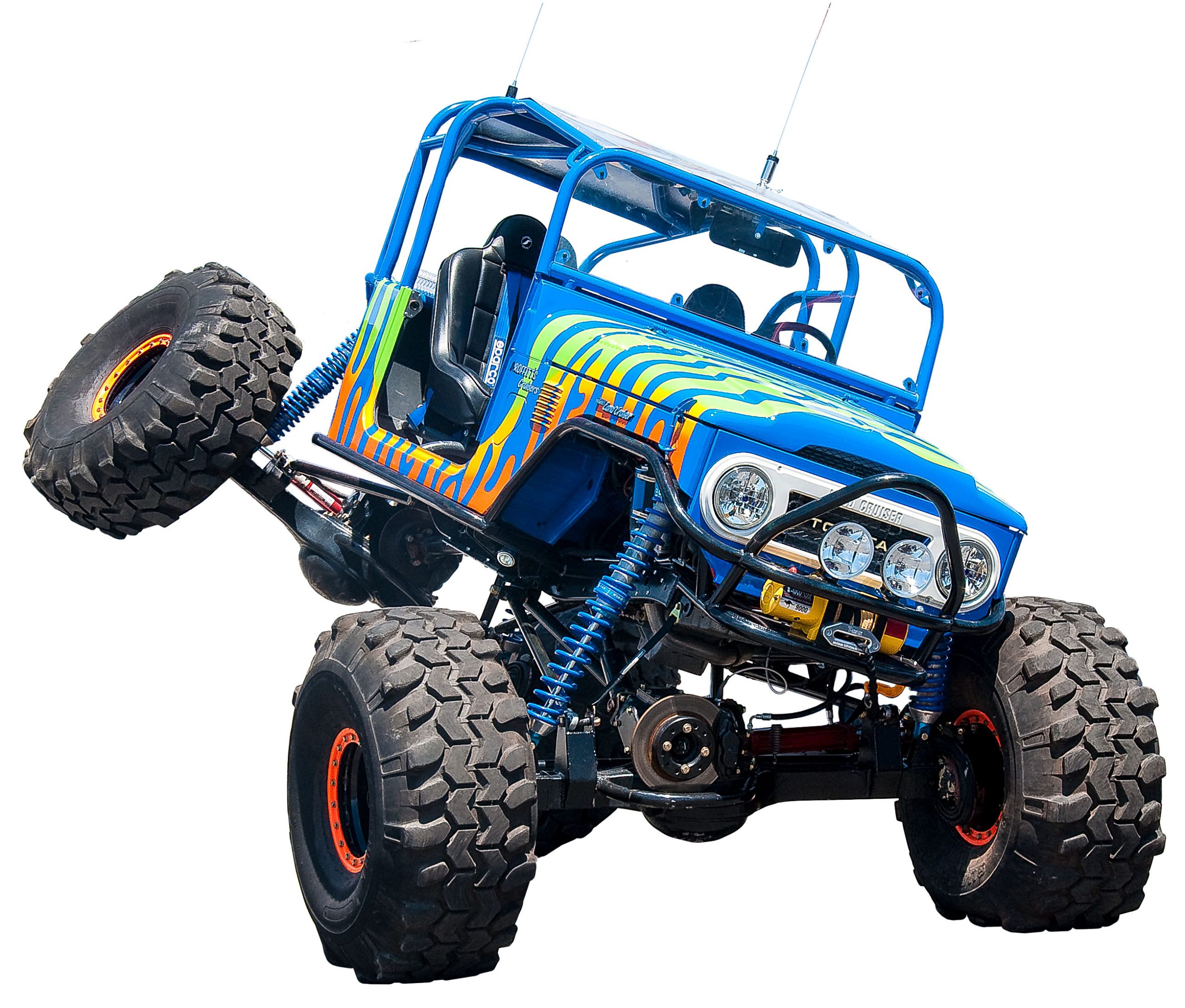
Texture, like shapes and lines can be a great communicator. Texture can give your design a soft comforting feel like someone would envision with silk or a plush toy. Or at can convey a rough and tumble attitude needed to to sell a recreation vehicle you can rely on in the tough circumstances. Working with texture can be a silent communicator that plays an important role communicating your marketing message.
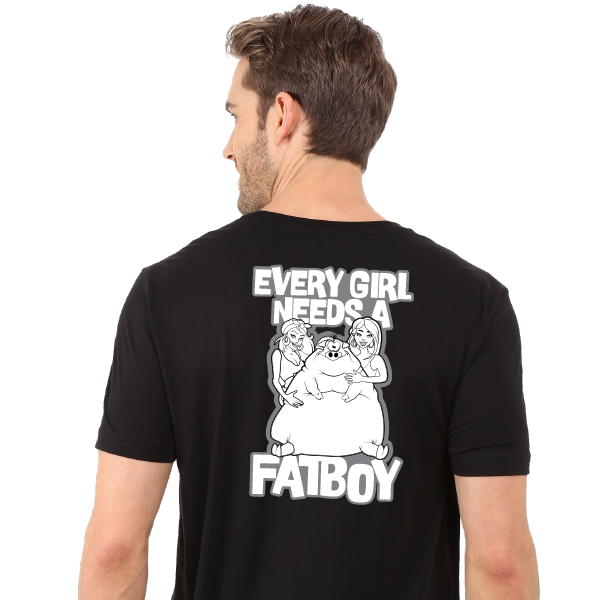
T-SHIRT DESIGN
Modern t-shirts have been described as the modern billboard. The modern t-shirt has adapted the roles of advertising, social expression and organizational identity. T-shirts are important tools to convey your marketing message at a local level.
PHOTOGRAPHY RESOURCES
Photography and dthe digital workflow go hand in hand. This section gives you tips on improving your photography skills as well as giving tips and techniques using Photoshop, Lightroom, Color Correction and Topaz AI products for post processing your photos.
Featured Lessons
Featured Design Helps
Periodically I feature a design or photography help that can be downloaded as a quick reference. These design helps will help you master certain production challenges faced on a daily basis. Sign up for my newsletter and you will automatically be notified when new lessons are available.
Using the Bezíer Pen Tool
This lesson helps you master the Bezier Pen Tool in Adobe Illustrator to helpp you create clean sharp images. This lesson also includes shortcut is mastering the drawing by showing you the keyboard shortcuts.

Simple 3D Effects
Learn some simple techniques that add dimension to your designs. Adding these 3D effect to your designs by using tools already available in Adobe Illustrator.
Let’s Design Together!
Address
Gunnison, CO 81230
Phone
(720) 592-5497
Follow Us
gbollig2@me.com